Why Your Landing Pages Aren’t Converting (And What to Do About It?
Landing pages are at the heart of any digital marketing strategy. They’re the final destination of a campaign’s traffic, where leads are generated and conversions happen. But what if your landing pages aren’t performing as expected? What if, despite the traffic, your conversion rates are still low? You’re not alone — and the good news is, you can fix it.
From disjointed designs to poor audience targeting, there are plenty of reasons why landing pages fail to convert. In this article, we’ll explore eight common landing page mistakes that marketers make, and the actionable steps you can take to improve performance.
1. Your Audience Targeting is Off
The Problem:
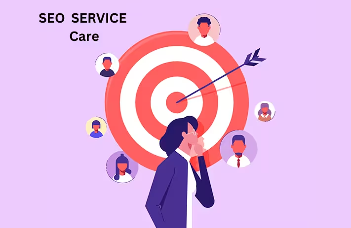
One of the most critical aspects of any landing page is ensuring that it is targeted toward the right audience. If your audience targeting is off, you’ll struggle to convert visitors into customers, no matter how well-designed your landing page is. A mismatch in demographics — such as age, location, or interests — can lead to low engagement, which directly impacts conversions.
Solution:
To fix this, you need to get to know your audience inside and out. Start by digging into customer data and fleshing out buyer personas. A buyer persona is a semi-fictional representation of your ideal customer, which helps guide decisions about everything from content creation to design.
Gather relevant data points such as:
– Age
– Job title
– Location
– Challenges
– Goals
– Preferred communication channels
This information allows you to tailor your landing page content, design, and tone to resonate with your audience. When your landing page speaks directly to your audience’s needs, you’ll see higher engagement and conversion rates.
Example:
If you’re targeting young professionals in tech, you might use modern, minimalist design elements, and emphasize time-saving solutions. On the other hand, a landing page targeting parents might focus on reliability, trustworthiness, and family-friendly language.
2. Your Landing Page Doesn’t Match Your Ad
The Problem:
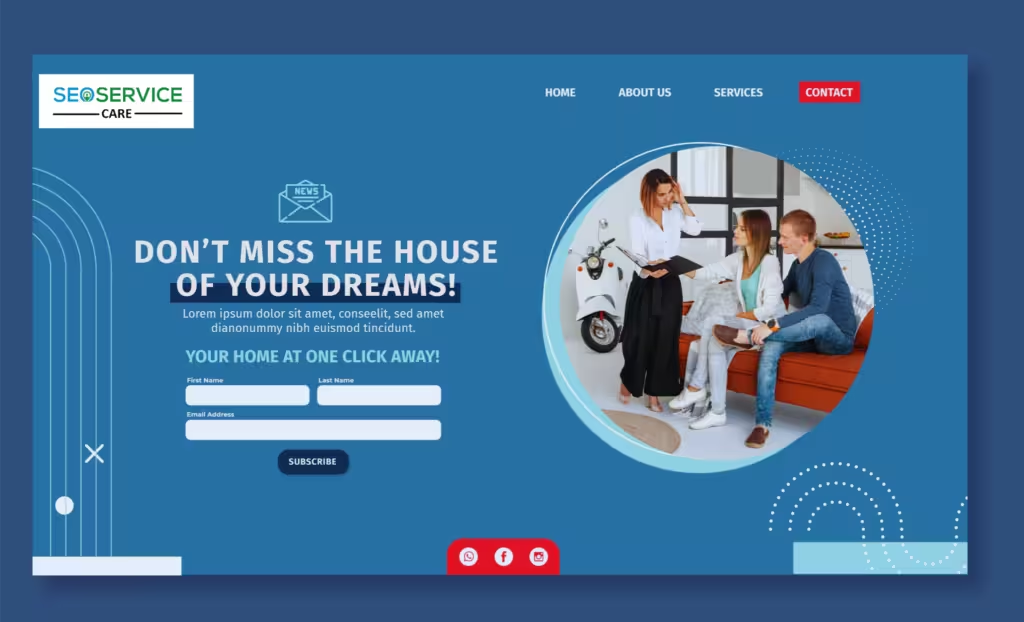
Imagine clicking on a compelling ad that promises a specific offer or product, only to land on a page that looks completely different, or worse, doesn’t even match the promise made in the ad. This mismatch can confuse visitors and cause them to abandon your page almost instantly.
Solution:
Consistency between your ad and landing page is essential for a smooth user experience. Ensure that the messaging, design, and call-to-action (CTA) in your ad aligns perfectly with what visitors will see on your landing page. The goal is to maintain familiarity and reduce cognitive friction.
Actionable Steps:
– Use the same headline or similar copy as your ad.
– Ensure visual elements (like images, colors, and fonts) are consistent with your ad.
– Ensure that the CTA in the ad leads directly to the CTA on the landing page.
Example:
If your ad promotes a 20% discount on a product, the landing page should immediately highlight that same discount with the same language and imagery. Visitors should feel like they’ve landed exactly where they were expecting to be.
3. The CTA is Unclear or Too Vague
The Problem:
The ultimate goal of any landing page is to get visitors to take action. Whether it’s filling out a form, signing up for a newsletter, or making a purchase, your call-to-action (CTA) needs to be crystal clear. If your CTA is vague or unclear, users may not know what to do next — leading to missed conversions.
Solution:
Your CTA should be clear, concise, and compelling. Avoid generic phrases like “Click Here” or “Submit.” Instead, be specific about the action you want users to take and the benefits they’ll get from doing so.
Best Practices for CTAs:
– Use contrasting colors to make your CTA button stand out.
– Focus on one clear offer per landing page.
– Be specific about the value (e.g., “Download Free E-Book” or “Get 20% Off Today”).
– Personalize CTAs when possible (e.g., “Get Your Free Trial, [Name]!”).
Example:
Instead of a generic “Learn More” button, try something like “Claim Your Free Demo” or “Get My Discount Now” to create urgency and clarity
4. Your Page Loads Too Slowly
The Problem:
Did you know that a one-second delay in page load time can result in a 7% reduction in conversions? Slow page loading is one of the most common but often overlooked reasons for poor landing page performance. If your page takes too long to load, users are likely to bounce before they even see your content.
Solution:
To avoid this, you must optimize your page for faster load times. You can do this by reducing unnecessary elements, optimizing images, and streamlining your code.
Actionable Tips:
– Compress images without sacrificing quality.
– Minimize the use of heavy JavaScript or animations.
– Choose a reliable and fast hosting provider.
– Use tools like Google’s Page Speed Insights to analyze and fix load speed issues.
5. It’s Not Mobile-Friendly
The Problem:
Mobile traffic now accounts for more than half of all internet traffic. If your landing page isn’t optimized for mobile devices, you’re missing out on a significant chunk of your audience. A landing page that’s difficult to navigate on a phone or tablet will lead to frustration and lost conversions.
Solution:
Make sure your landing page is fully responsive — that is, it should adjust to any screen size, from desktops to smartphones. The goal is to offer a seamless experience across all devices.
Mobile Optimization Tips:
– Ensure that your CTA buttons are large and easy to click on mobile devices.
– Simplify your design to make navigation intuitive on smaller screens.
– Optimize images for mobile load times.
– Use mobile-friendly forms (e.g., with autofill or fewer fields).
6. The Page is Too Wordy
The Problem:
If your landing page is filled with long paragraphs of text, visitors may get overwhelmed and leave before they read anything. In the fast-paced world of online browsing, people want information quickly and easily. A page that’s too wordy can lose attention and decrease conversions.
Solution:
Keep your copy concise, benefit-oriented, and easy to scan. Visitors should be able to quickly understand the value you’re offering and what you want them to do next.
Best Practices for Landing Page Copy:
– Use headers, subheaders, and bullet points to break up text.
– Keep sentences short and to the point.
– Focus on benefits rather than features.
– Include a strong value proposition early in the content.
7. There Are Too Many Distractions
The Problem:
A cluttered landing page with too many distractions — such as pop-ups, external links, or excessive visuals — can overwhelm visitors. The more choices visitors have, the less likely they are to complete the desired action.
Solution:
Simplify your landing page by removing unnecessary elements. Every element on the page should serve the goal of the landing page — getting the visitor to convert.
Distraction-Free Design Tips:
– Limit external links — only link to content that supports your conversion goal.
– Avoid pop-ups that interrupt the user experience.
– Use plenty of white space to keep the focus on the CTA.
– Keep the page layout clean and easy to navigate.
8. People Don’t Trust Your Page
The Problem:
Trust is a crucial factor when it comes to conversions. If visitors don’t trust your site, they won’t fill out a form, make a purchase, or engage with your business. Lack of social proof, security badges, or clear contact information can contribute to a lack of trust.
Solution:
Leverage trust-building elements on your landing page, such as customer testimonials, product reviews, certifications, and security badges. Social proof can be a powerful motivator for people to take action.
Trust-Building Strategies:
– Include client testimonials, reviews, or case studies.
– Display security badges or certifications.
– Add contact information and an easy way to reach customer support.
– If possible, feature recognizable logos of clients or partners.
How to Measure What’s Working (And What’s Not)?
Once you’ve implemented these fixes, it’s crucial to monitor and measure performance to ensure your landing page is converting at its highest potential.
Key Metrics to Track:
– Conversion Rate: The percentage of visitors who take the desired action (e.g., submit a form, purchase a product).
– Bounce Rate: The percentage of visitors who leave the page without interacting.
– Time on Page: How long visitors stay on your landing pages — an indicator of engagement.
– Heatmaps: Visual representations of where visitors are clicking and how far they scroll.
Conclusion
Improving your landing page conversions isn’t a one-size-fits-all task, but by addressing these common mistakes — from targeting the wrong audience to confusing CTAs — you can significantly boost your page’s performance. Remember, consistency, simplicity, and trust are key ingredients for success.
If you need more help or have questions about managing your landing page, feel free to contact us today to learn more!
By continuously testing and optimizing your landing page based on data-driven insights, you’ll soon see your conversion rates improve. And if you need help navigating this process, there are plenty of tools and experts (like us) ready to help you optimize and transform your landing pages into powerful conversion machines.
